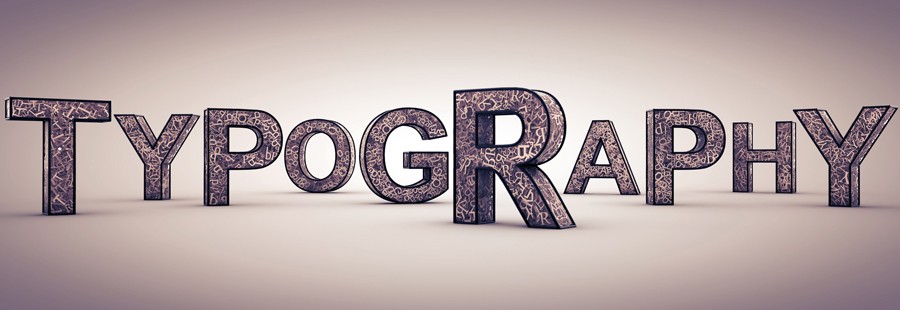
6 Things to Consider When Choosing a Font for a Website
Typography is a huge part of a website, its usability and overall success. After all, even with all the recent technology breakthroughs and minimalistic trends, the web is still very much about text.
Choosing a typeface can be a tricky task, it seems like a new typeface appears every half an hour these days, their beauty and complexity can make even an experienced designer or website owner stuck.
While there is no rule or step-by-step guide on how to choose a typeface, there are principles and best practices that have been tried and approved by thousands of web designers and website owners for years.
These principles described below can be of use for beginner web designers, new website owners and reasoned ones, who want to customize their web template on their own, and those who are choosing a template for their online business and want to make sure the font on the chosen template is appropriate.
Readability
It should be obvious really. What do we do with type? Yep, we read it. Logically – the typeface has to be readable, but the number of websites with unreadable text (be it tiny font size or line height, or just ugly fonts) makes me think it’s not that obvious.
-
Here are the common traits of readable texts:
- The typeface chosen is designed for the purpose it’s being used for (for headlines – display fonts, for body copy – body copy typeface etc.)
- The text is aligned to “right ragged” which makes word spacing more comfortable.
- The line height is greater than the point size of the chosen typeface.
- The interline is large enough. It’s very hard to read a line of text when the line above it and the one below are too close to it. Crammed lines, overlapping each other are very hard to read.
Typefaces
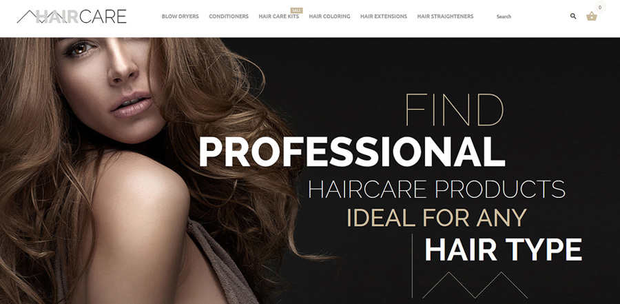
Many designers hate the overused Helvetica. But why reinvent the wheel? Helvetica is so overused simply because it’s good, very-very good. It looks great on pretty much any design, it works good both in small and large sizes. So if an overused typeface works for your project – just go with it! Don’t over-think it.
-
A couple of tips for choosing a typeface:
- The body copy is the part that has to be the most readable one, so make sure the type you choose works good in small sizes. If you can make out what your copy says when it’s set to 10px – that’s a readable typeface, so go for it.
- As for the titles – if you can make out what a large title says immediately than the font is readable.
There is no formula or rule, or guide for choosing right fonts. It’s usually a good idea to try each font you like and compare the results.
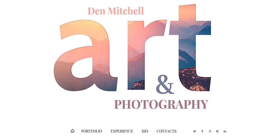
Pairing
I tried remembering a website that uses only one typeface, but I couldn’t. A website usually has a lot of text, and there simply is no way one typeface could work with it all. The majority of websites typically use two typefaces – one for headlines and one for body copy.
Naturally, when choosing a pair of typefaces the first thing to consider is how they look together. Are they too similar or too different? Not similar enough? Not different enough? These are the questions to be asked. Again – comparing all the fonts you like side by side here is a great way to choose.
If you are stuck, here is another good idea – go with the classics. Check the reputable typography-related resources, you are sure to find some tried and true combination.
Size
The majority of websites have the body copy size set to 12px-14px. The titles size is a bit trickier though. There is no general rule here again, the seasoned web designers say that the title size has to be as big as it should be. Try different sizes and stick with the one which suits your project best.
Color
This one should probably be in the readability paragraph of this post. The proper, contrasting color is essential for readability. Black text on white or light background is the classics. Feel free to play around with the colors, just remember the contrast.
Match The Design
Typography is a part of website design, not the whole thing, though it is of the utmost importance.
My point here is – the typeface you choose should work with the rest of the design, complement it even.