Get Acquainted With Material Design
Web design world is susceptible to trends and fads like no other. There’s a new rage in web design every couple of months. Yesterday it was parallax scrolling every website had to have, today it’s hero headers and ghost buttons. Who knows what it’s gonna be tomorrow. Well, Google does actually. Google knows everything 🙂
The latest rage in the web design industry is Google’s material design, and it’s quite obvious this is not some fad, it’s gonna stay with us for a while, maybe even become a standard of sorts.
Google Design Perception
According to Google’s own design guide:”We challenged ourselves to create a visual language for our users that synthesizes the classic principles of good design with the innovation and possibility of technology and science. This is material design.”
Yes, there’s a whole comprehensive guide from the Google designers themselves, you don’t have to invent anything just follow the guide and be in trend.
If you are a part of design community, you might have heard an opinion that material design is nothing but flat design with a new name and the Google stamp on it. It does look more flat than anything else we’ve ever seen in web design before, but if you take a closer look you’ll see so much more in material design. Let’s take that closer look now!
Material Design Main Features
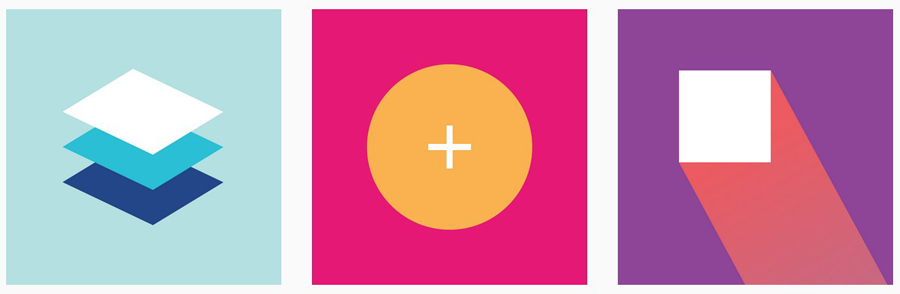
Vibrant colors
The colors in material design are inspired by the real life surroundings – architecture, athletic courts, road signs, pavement markings etc. As in real life deep shadows, bold hues and bright highlights are juxtaposed with muted environments.
You need to remember – everything in material design is supposed to serve one goal – create a flawless user experience. Thus the deliberate use of color, space, scale and bold typography and every other element of design are not just pleasing the eye, they create hierarchy, focus and meaning.
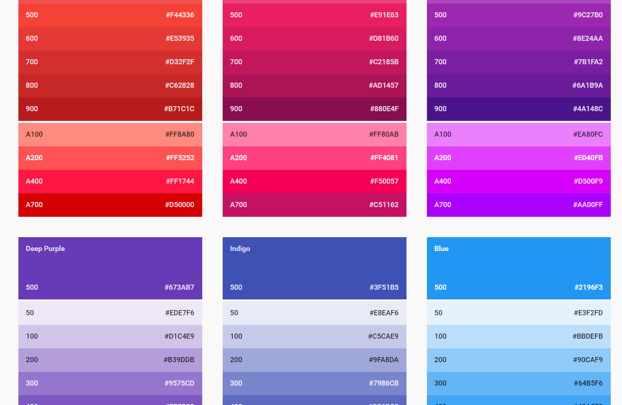
Getting back to the material design guide book – Google even offers you ready-made color palettes!
Engaging Imagery
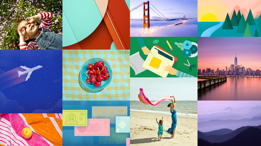
Relevant images enhance user experience, they set the mood and help you communicate with the user. Imagery is not simply a decoration, it’s a powerful tool and you need to use it wisely. Stock images are not recommended, the more original, relevant to context and informative the image the better.
Bold Typography
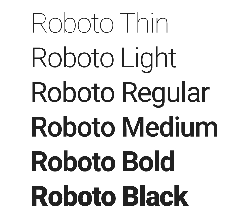
Google has standardized their typeface use long ago, their main fonts are Roboto and Noto. You do not have to use those fonts for your designs, what you have to use is a large, dynamic font that is easy to read.
Comprehensive Text
Have you ever seen a website or an app without a word on it? Text is tremendously important, and since our goal is to create a flawless user experience you have to make sure the text in your project is understandable by anyone, whichever their language or culture is.
Consistency
Repeating visual elements, spacing and structure you create consistency and better overall user experience. And this last one is the goal, remember?
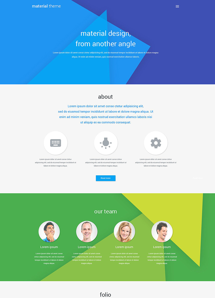
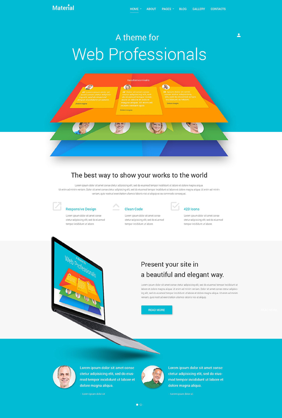
Material Design Web Templates
Our designers have already studied the guide. So if you want a faster way to get a material style website I can offer you these professionally done material style web templates.
Material Joomla Template
Web Design Storage WordPress Theme
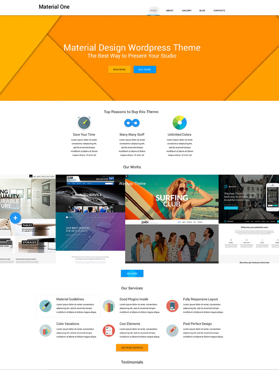
Material Design Portfolio WordPress Theme