How To Create Better Mobile Web Typography
Creating designs which are as effective and pleasing to the eye on a desktop PC as they are on a mobile device presents any designer with a number of challenges. The reality is that creating responsive websites for mobile devices is a skill every single web designer needs to learn, unless they want to be left behind when the industry, and its customers, moves forwards. One of the key areas to focus on when looking at the typography for a mobile site is a better understanding of
audience behaviour and need; if you can gain a better understanding of that then your mobile web
typography will improve dramatically as a result.

No Magic Formula
As much as I’d love to be able to provide you all with the three steps which cure all well web typography woes that won’t ever happen. What I can share with you is that the idea of using “points” to create fixed typeface sizes is a thing of the past. You need your typography to be far more flexible, so please think in ems or rems instead – most mobile designers are leaning towards
rems these days. Another rough guide to work with is that no single line of text on a responsive site should be any longer than 35 characters in length.
The Human Factor
This might sound like a gigantic case of stating the obvious, but if users can’t read the text on a
mobile site then all of your design efforts and ideas have been a waste of effort. I’m always stumped when I see any designer approaching a responsive site looking only at what’s visually pleasing, and ignoring whether or not the site is actually legible in the first place. Look at how people read, and how you use your mobile device to read. Then think about what your pet hates are in other mobile designs you’ve come across. Now create mobile web typography that works based on those influences – see it doesn’t need to be rocket science.

For instance, this responsive restaurant template has very readable type.
KISS Typefaces
If you’re not familiar with the KISS principle it stands for: Keep It Simple Stupid. If you want to avoid making awful mobile web typography decisions then avoid using typefaces which are ornate, quirky or could cause any potential issues with UX. This follows on from my point above that if users can’t read the text on a site then the site itself is rendered redundant almost instantly. Keep your typeface choices simple, stick with what works, and avoid using text effects unless you have a specific reason for doing so.

See how this hosting Drupal theme text changes color when you hover over it? It’s enough to grab reader’s attention, yet it’s not obtrusive at all. Besides, it actually makes the text more readable.
White Space
Staring at a smaller screen puts more strain on your eyes than you might imagine. So when users are forced to squint at blocks of text crammed together on the screen – with no horizontal or vertical spacing used – they’ll lose interest very quickly. You don’t need me to tell you that “less is more”, so please add a little bit of white space in your mobile typography. If you need some guidance on what works then check out the Kindle Reader app for Android or iOS devices – it’s a fantastic lesson in creating mobile typography accessible to millions of people.

Here’s a good example. This text-reach baby food website template has rather playful fonts, but they are readable and the white space is exactly enough to make the text easy on the eyes.
Alignment Issues
You know that how you align blocks of text can have a serious impact on the readability of a mobile website, right? The first tip here is to avoid using justified alignment – it forces the human eye to jump around too much when reading text, and also looks lousy from a design perspective. Some designers say that all your text should be aligned left with no indenting, but I’ve seen other great examples of web typography where a first-line indent is used, and it works well from a legibility perspective. What you need to remember here is that centre alignment is out, as is justified alignment, plus you need to make your text alignment predictable and consistent; otherwise your text becomes a garbled mess of characters.
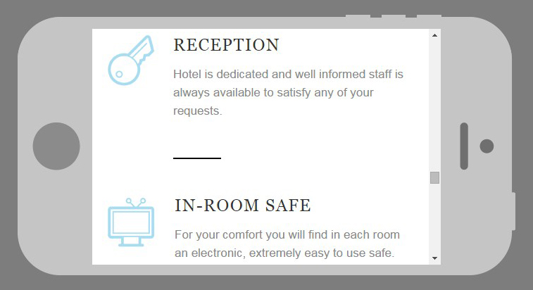
This responsive hotel newsletter template is a pretty good illustration for good alignment of mobile text.
In Summary
If you don’t understand how to create good mobile web typography then now is the best possible
time to start learning. The industry is shifting rapidly towards responsive design becoming the norm, so if you lack the ability to provide clients with mobile web typography which “works”, then you’re going to find your design skills in far less demand over the next few years.
ABOUT THE AUTHOR