Web Design and Color Theory
Web design is obviously a very visual type of communication, and colors play a very essential part in this. Understanding the meaning of colors, how they work together and what emotions each color evokes, you can create better websites and provide your customers with powerful tools for gaining true success.
Now, color theory is a science in itself, but you as a web designer do not really need to know it all to create powerful designs. The basics of color theory should have you covered. Though it is quite an interesting subject to look into, so I strongly recommend reading more. If not for advancing in your career then for inspiration and a fascinating pastime. You might have guessed by now what we are going to do today – look into the basics of color theory, of course!
This post is obviously going to be the most beneficial for web designers that are just at the beginning of their careers. The more experienced designers will, however, find it quite helpful too. I’ve included the most recent trends in modern web colors at the end of this post so you’ll get quite an inspiration here.
So let’s start.
What exactly is color theory?
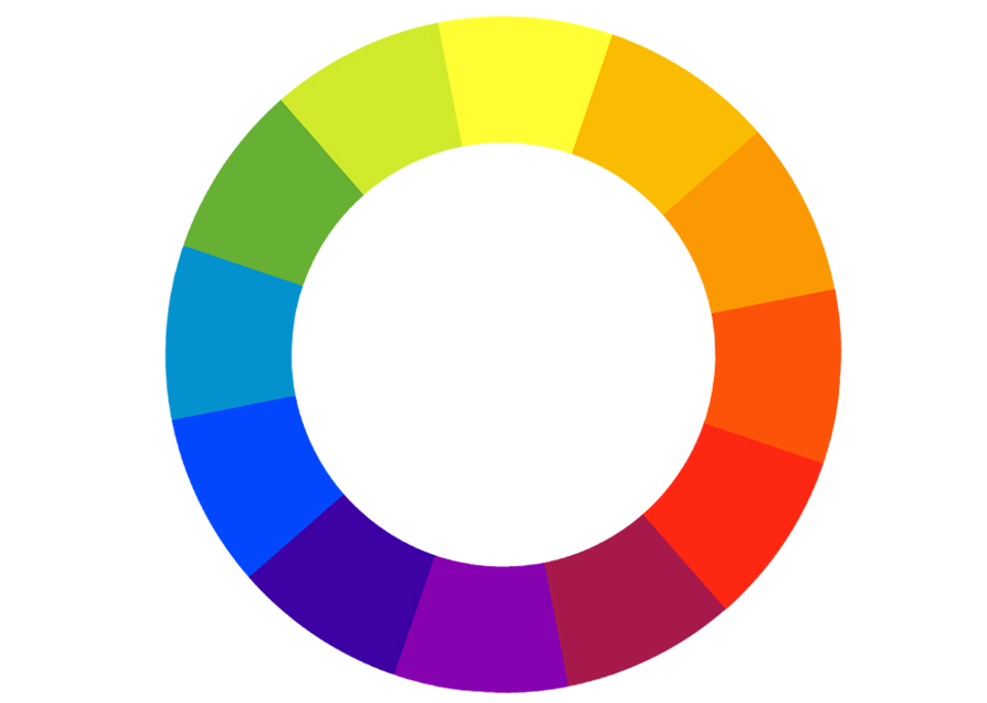
The wealth of knowledge Wikipedia tells us – color theory is a body of practical guidance to color mixing and the visual effects of a specific color combination.
The aspects of color theory that interest us the most are complementation, contrast and vibrancy.
Complementation
Complementary colors are opposite each other on the color wheel, for example green is complement to purple. These colors used together to create the most eye-pleasing balanced visuals.
Contrast
Contrast is a great instrument when it comes to dividing elements and focusing user attention. In web design the most obvious use of contrast that comes to mind first is the text and background color choice. The best practice is considered the light color for background and dark for the text. Keep in mind that text on a web page has to be readable, this is not the place for unnecessary experiments better keep it simple.
Contrast is good for drawing user’s attention to the specific areas on a page. So using various contrasting colors can help you focus the visitor’s attention on those parts of the web page that are most important.
Vibrancy
There’s no denying that colors create emotions and set specific moods and atmosphere. Vibrancy is the thing that does that. Darker colors such as green, purple, blue tend to create a more relaxed mood, while brighter warm shades like yellow, orange and red energize the user, create a more alert mood.
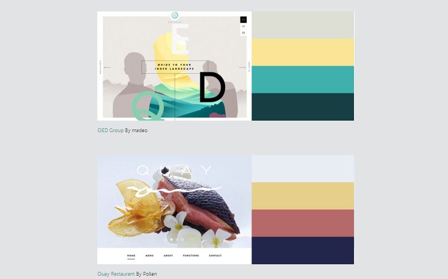
Choosing an effective color scheme
There is a number of ways to choose the best color palette for a project, the most common of those are Triadic, Compound and Analogous.
Triadic Color Scheme
This color scheme is composed of 3 colors on the opposite ends of the color spectrum. Choose your base color on the color wheel, draw an equilateral triangle from that point, and there you have it – the three colors for your Triadic color scheme:
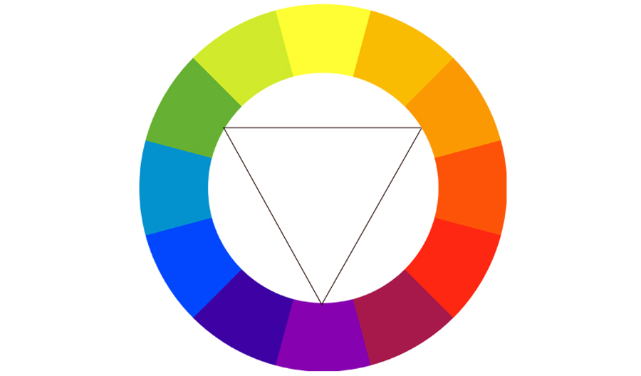
This approach will give you the best complementing colors of equal vibrancy.
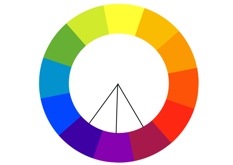
Compound Color Scheme
This approach is based on complementary colors chosen from the opposite ends of the color wheel. There’s usually two colors in the compound scheme, but you can always expand with shades, tones and tints.

Analogous Color Scheme
An analogous color scheme is created of 3 colors next to each other on a color wheel. You might think using colors with the same chroma level is boring, but you can always add shades, tones and tints and make the color scheme more exciting.
These are just the simplest approaches to creating color schemes and the most basic explanations of them, if you’d like to read more on this subjects I recommend this comprehensive guide.
The most trendy colors in web design
With the rise of material design it’s safe to say that bold bright colors are going to be the trendiest ones.

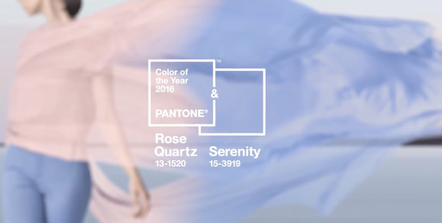
For those online projects that are affiliated with fashion it’s always a good idea to look into what Pantone recommends. They choose a color of the year and this year it’s not one but two:
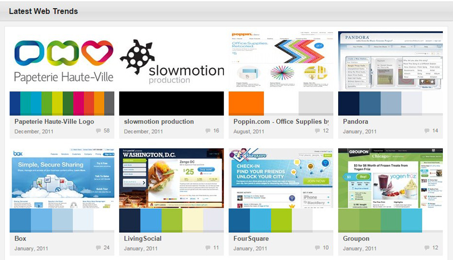
Another great idea for choosing a trendy color scheme is looking at ColourLovers:
And Awwwards: